| Art culture | |||||||||||||||||||||
|
colour
1 |
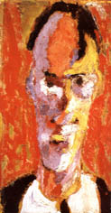 Marino
Tartaglia: Marino
Tartaglia: Selfportrait, 1917. |
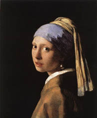 Vermeer Van Delft:
Girl with Pearl Earring, 1665. |
|||||||||||||||||||
|
|
|
||||||||||||||||||||
|
Let´s
describe the colours in these paintings once again:
|
|||||||||||||||||||||
|
Tartaglia: according to hue,
we see yellow, orange, red, purple, white, and black colours (basic,
derived, and non-colours). The colours don´t have shades.
According to saturation, they are vivid
and intense. The complementary pair
yellow - purple is present. The warm - cold contrast
is used among the colours. The colours are modulated
- where there is a shadow, they are cold; where there is a light, they
are warm.
|
Vermeer: according to hue, we see blue, orange, white, and black colours (basic, derived, and non-colours). The colours have shades in smooth transitions (modelation) by which they create an illusion of light, shadow, and the roundness. There is a lot of brown shade. According to saturation, the colours are pale. The light - dark contrast is used among the colours, especially between the black and white colours on the collar, the eyes and the earring. | ||||||||||||||||||||
|
|
|||||||||||||||||||||